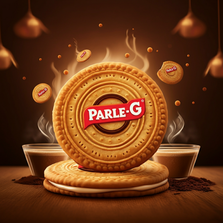
Few products are as engrained in India’s cultural fabric as Parle-G biscuits. From being the go-to companion of chai to offering a nostalgic bite-sized escape, Parle-G has been a household staple for generations. Once dubbed “The World’s Largest Selling Biscuit,” this modest glucose biscuit isn’t just a snack; it symbolizes comfort, affordability, and tradition.
However, any iconic brand must evolve to stay relevant. Enter the Parle-G new logo, a redesign that has sparked conversations among biscuit lovers and graphic designers alike. What does this shift mean for one of India’s most-loved brands? Let’s explore.
A Look Back at Parle-G’s Logo Evolution
Since time immemorial (or what it feels like), Parle-G’s packaging has been synonymous with its iconic elements—its warm yellow background, the hyper-recognizable “Parle-G Girl,” and bold red typography. This visual identity hasn’t just adorned shelves; it has imprinted itself in the collective memory of millions.
Over the decades, Parle-G’s logo underwent subtle updates to align with changing times. Earlier versions exuded a vintage, hand-lettered charm, while later iterations became cleaner and more digital-friendly. However, the brand’s emphasis on retaining the essence of nostalgia ensured minimal deviations from its core design language.
With the launch of the Parle-G new logo, the brand has taken a leap forward, balancing its rich legacy with modern sensibilities.
Deconstructing the New Parle-G Logo
The recently unveiled logo maintains a clear connection to its predecessor while incorporating thoughtful modern upgrades. Here’s an in-depth look at its visual elements:
Bold Yet Simplified Typography
The new logo showcases a sleeker, more refined typeface that retains the iconic red hue. Simplified edges and clean lines give it a contemporary feel, making it suitable for digital-first branding strategies. It nods to Parle-G’s enduring identity while speaking the language of today’s minimalist design trends.
An Updated Primary Palette
While the signature red and yellow colors remain intact, they’ve been updated with richer saturation and more balanced proportions. The interplay of these vivid hues ensures impactful recall in today’s highly competitive retail landscape, both on physical shelves and online marketplaces.
Icon Placement and Balance
One surprising feature is how the Parle-G Girl is subtly integrated into the overall design. While she doesn’t dominate the logo, her presence is cleverly preserved, respecting her nostalgic value for customers. This careful balancing act allows for a seamless blend of heritage and innovation.
The Journey Behind the Redesign
Every logo redesign is backed by a story—and Parle-G’s new logo is no exception. According to Parle’s design team, the process began with an ambitious brief—to create a logo that aligns with modern consumers’ sensibilities while preserving the deep-rooted emotional connection of a brand adored for nearly a century.
The redesign phase included:
- Extensive Research: The team studied global packaging trends alongside feedback from focus groups, ranging from loyal consumers to younger audiences.
- Iterations and Testing: Dozens of prototypes were tested to ensure the updated logo resonated with multiple demographics.
- Staying True to Roots: Throughout the process, there was unanimous agreement—Parle-G’s heritage must remain the focal point.
“The Parle-G Girl and the red-and-yellow palette are emeralds in our visual crown, and they were non-negotiable,” shared one of the designers. “The challenge was integrating them while making the logo future-ready.”
Reactions to the New Logo
Naturally, the design community and biscuit lovers shared their reactions once the Parle-G new logo went live.
Among Graphic Designers
Many applauded the logo for its clean, timeless qualities. Design forums recognized the effort to strike harmony between nostalgia and modernity—a task often harder than it appears. Others debated whether it could have pushed boundaries further while maintaining its recognizability.
Public Sentiment
There’s always bound to be a spectrum of opinions with any redesign. While many adored the contemporary touch, a small segment expressed mild resistance, claiming they’d always prefer the original charm. These discussions, fueled by social media, have only amplified the spotlight on the redesign effort.
Why Logos Matter in Branding
Logos are more than just design elements—they serve as the face of a brand. With a logo like Parle-G’s, steeped in decades of recognition and trust, the stakes are particularly high. A strong logo achieves the following:
- Brand Recognition: The logo is often the first point of contact between a product and a consumer.
- Cultural Relevance: Updates help brands remain relevant while competing consistently in evolving markets.
- Storytelling: Logos convey intangible brand values—like tradition, quality, or modernity—at a glance.
Parle-G’s reimagined identity honors these principles, ensuring it stays a frontrunner in both old and new markets.
What the New Logo Means for Parle-G’s Legacy
At its core, the Parle-G new logo is far more than a cosmetic update—it’s a strategic move with implications for market positioning and consumer perception.
- Engaging a Younger Audience: The fashionable design ensures resonance with younger, brand-sensitive consumers exploring premium biscuit categories.
- Global Appeal: The minimalistic makeover positions Parle-G as a global-ready brand, grabbing international attention with ease.
- Revitalization of the Brand: The overhaul reaffirms Parle’s commitment to staying adaptive while remaining anchored to its values.
For long-time fans, the updated logo acts as a reminder that Parle-G is evolving alongside its beloved consumers—a testament to the brand’s reliability and adaptability.
Looking Ahead: The Future of Parle-G
With its refreshed look, Parle-G is poised to win over both loyal customers and newer generations of biscuit lovers. The redesign demonstrates that nostalgia doesn’t have to anchor a brand in the past—it can serve as a springboard for innovation.
Graphic designers, keep an eye on Parle-G—it’s the perfect case study in blending tradition with modernity. And for biscuit enthusiasts? The taste you love hasn’t changed; it’s simply donned a sharper suit.

